In Babek International v. Iceland, HHJ Hacon has provided a useful analysis of the law on clarity and precision for trade mark filings, applying Sieckmann, Libertel and Cadbury. It is essential reading for all those filing trade marks and managing trade mark portfolios.
Case name: Babek International Ltd v Iceland Foods Ltd
Court: Intellectual Property Enterprise Court
Citation: [2025] EWHC 547 (IPEC)
Judge: His Honour Judge Hacon
Judgment: Here
Trade marks: UKTM 907527963
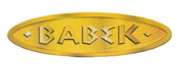
Mark description/limitation: “Gold oval with embossed BABEK writing. Colour Claimed: Gold, black.”
Class 29: Meat, fish, poultry and game; meat extracts; preserved, frozen, dried and cooked fruits and vegetables; jellies, jams, compotes; eggs, milk and milk products; edible oils and fats.
Background
In March 2024, Babek International commenced proceedings against Iceland before the Intellectual Property Enterprise Court for trade mark infringement. Iceland accepted that it used an identical sign for identical goods, but asserted that it had the consent of the former proprietor or was under licence by a third party. It also counterclaimed that the trade mark was invalid.
Application
Iceland sought summary judgment on its counterclaim for invalidity, arguing that the registration did not satisfy the requirements of s. 1(1) and 3(1) of the Trade Marks Act 1994. In particular, it asserted that Babek International’s trade mark was ambiguous and lacked clarity and precision because of, among others, the following:
- while the trade mark was described as a figurative mark, the description included the word ‘embossed’ which suggested that the sign to be protected was a 3D sign, so that the visual representation was just one image of the sign
- while the trade mark showed an ellipse, the written description indicated that the trade mark could be in any oval form
- the claim to the colours gold and black were not specific as to hue and many hues of gold were shown in the visual representation but black did not appear
- the visual representation included colours other than gold and black, namely white, yellow, orange, beige and brown
Decision
HHJ Hacon provided a useful summary of the case law, concluding that the trade mark was validly registered and stating that Iceland’s arguments “assumed [a] degree of pedantry on the part of the competent authorities and the public which, if required in law, would make the trade mark system unworkable”. He reasoned:
- there was nothing inconsistent between the trade mark’s description/limitation and the visual representation. The reader was told that it was a figurative mark and therefore a 2D mark, not a 3D mark. Accordingly, the visual representation could be and would have been understood to show a 2D mark with 3D visual effects. He saw no reason to suppose that the competent authorities and the public should be taken to consist of “anxious pedants”
- the complaint that the visual representation showed an ellipse, not an oval as stated in the written description, was “fairly high grade pedantry”
- in the instance of any colour per se mark, use of one or more pantone numbers or other means to specify hues is likely to be important. For other types of mark which feature one or more colours, it may or may not be. He gave the example of trade mark registrations for Coca-Cola and Tesco which claimed “the colours red, silver, white and yellow as an element of the mark’ and “the colours red and blue as an element of the mark” respectively, without specifying the pantone numbers. Citing J. Sainsbury’s PLC v Fromageries Bel SA [2019] EWHC 34354 he noted that “[t]he point about [the examples above] is that the precise hue is unlikely to play a significant role in making the mark capable of distinguishing. The hues could vary without affecting the mark’s capacity to distinguish”. He reasoned that the observation could equally be said to apply to Babek International’s trade mark
- as to Iceland’s final point was that there were colours in the visual representation which are not strictly either gold or black, he acknowledged this was true, but that to his eye the impression delivered by the visual representation is of a trade mark coloured gold with shading and the shading was an approximation of black
Disclaimer
This information is for general information purposes only and does not constitute legal advice. It is recommended that specific professional advice is sought before acting on any of the information given. Please contact us for specific advice on your circumstances. © Shoosmiths LLP 2025.